Pine
2024
Mortgage dashboard redesign
Redesigning Pine's daily dashboard around priority, so advisors and fulfillment act on what matters first instead of rebuilding it in spreadsheets.

Overview
The challenge
Evergreen's Pipeline was the dashboard the whole company ran on, and mortgage advisors and the fulfillment team leaned on it hardest. The problem was that it treated every deal the same, so both teams improvised. Advisors exported to spreadsheets just to figure out what to work on first, and fulfillment hand sorted client images into folders inside folders, one client at a time. Everyone spent the first part of their day rebuilding a picture the tool should have handed them, and that was never going to scale into our upcoming Wealthsimple partnership.

Before: a kanban board that gave every deal equal weight and no sense of priority.
My role
Owning it end to end
As the only designer at an early stage startup, I owned scoping, research, IA, interaction design and the V1 spec, working with my PM and two engineers. The partnership deadline meant phasing the redesign rather than shipping it all at once.
Research
Finding where the friction really sat
I audited the existing dashboards and talked to around eight advisors plus a few people on the fulfillment team to find where the friction actually was. One complication showed up fast: advisors and fulfillment used the same dashboard but needed different things from it.
Insights
Data without direction
The dashboard gave every deal equal weight, so advisors exported to spreadsheets just to decide what to tackle first
Busywork before work
Both teams spent the start of every day rebuilding a picture the tool should have surfaced, and that overhead was only going to grow as the company scaled
Design
Designing around priority
Priority first: An expandable-row table puts what needs attention up front. I went with a table over cards because both teams compare files side by side.
Detail on demand: Rows expand for the full file, so the default stays scannable without hiding anything fulfillment needs.
Built for two teams: Advisors and fulfillment act on the same data differently, so I added lightweight customization to let each shape its own view.
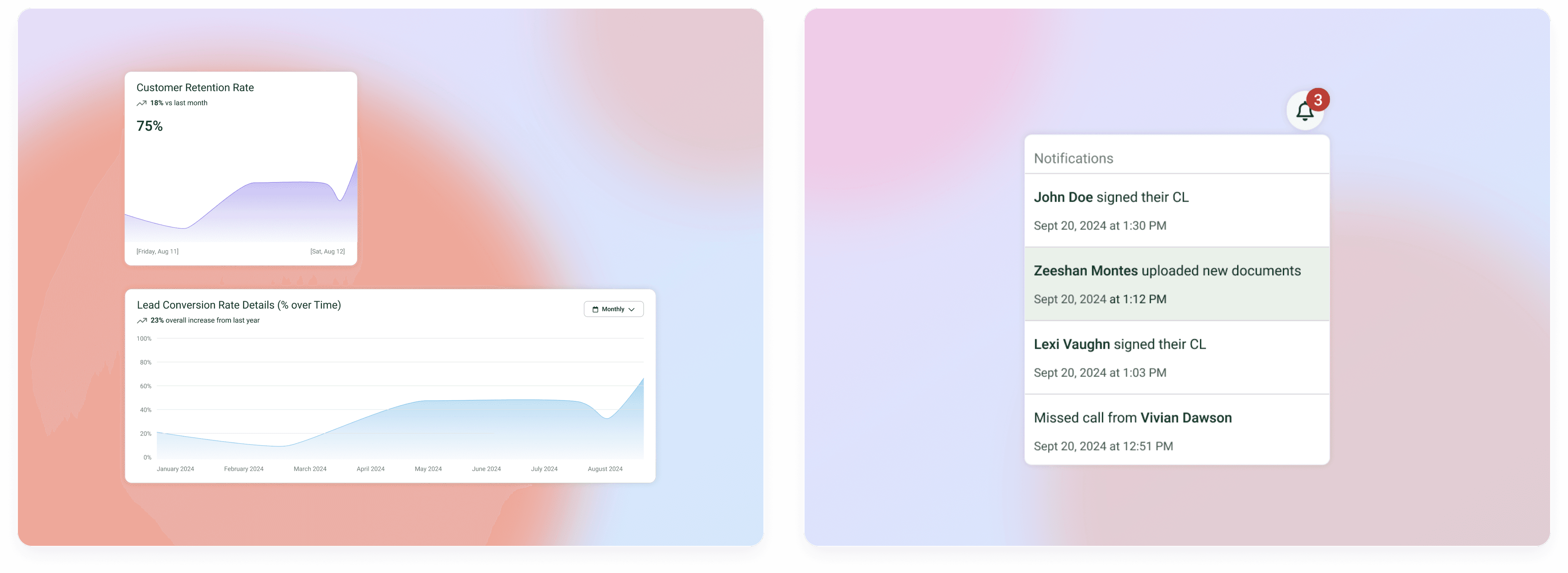
V1 shipped as the priority table with expandable rows: essentials up front, detail on demand. I deliberately pushed the metrics overview and data visual to a later phase so V1 could hit the partnership deadline and prove the core interaction first.

Results
Setting the launch up to learn
Because it launched so close to the partnership, I set the release up to learn rather than to claim wins. I defined success as faster time-to-first-action, fewer spreadsheet exports and higher reported ease across both teams, and I paired usage analytics with follow-up interviews so the next round is driven by evidence, not assumptions.


